Clinker tower in Antwerp Original white brick building
The original design of a residential building made of white brick introduced a lot of freshness to the coastal district of Antwerp. The modern and interesting façade of the building brightened the area, becoming its integral part.
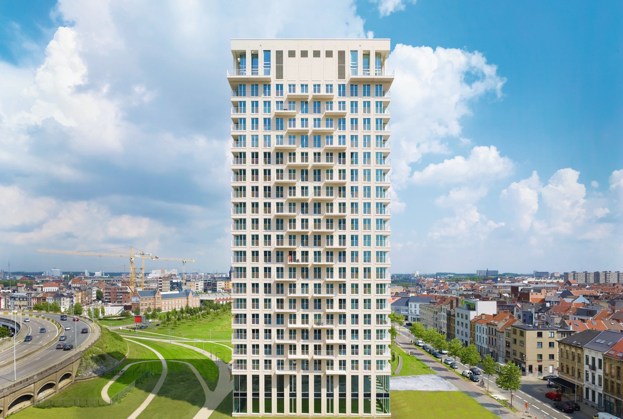
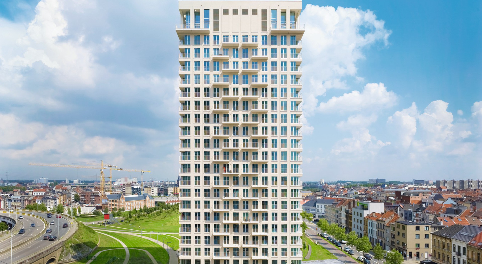
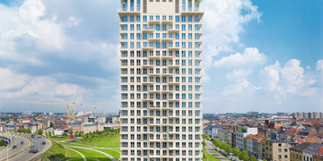
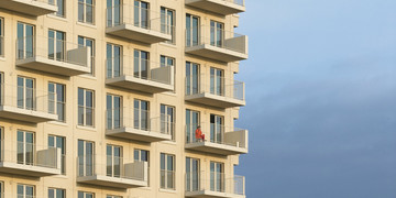
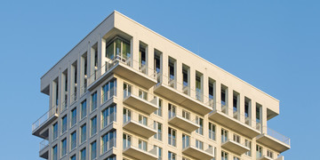
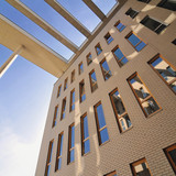
A house designed by AWG Architecten, called the Luminous Tower, was built in the immediate vicinity of the port of Antwerp. There are a total of 147 apartments on 22 storeys. The flats have narrow and tall windows that present an amazing view of the port and the city in the elegantly shaped bright clinker façade.
Exceptional location
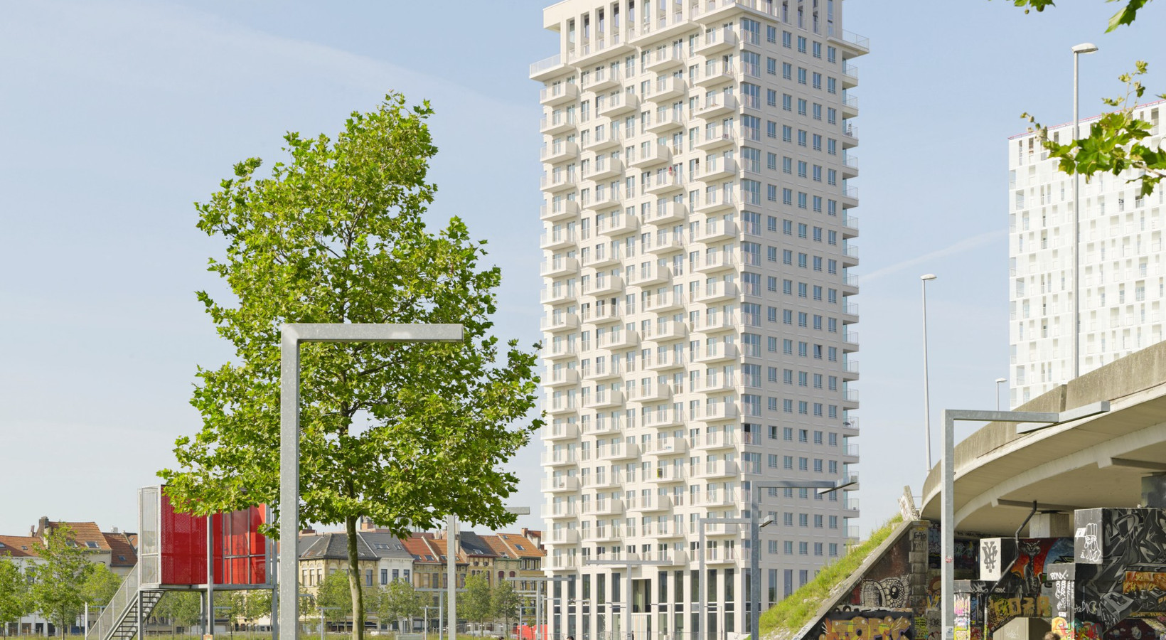
Antwerp has the second largest container port in Europe, right after Rotterdam. The historic port area, after moving port facilities to the north, remained neglected and forgotten. In the meantime, along the old port pier, a modern office and residential district was created. The construction of a new hospital, yacht port and two universities is planned on the plot adjacent to this area. The design of tall buildings is an important and characteristic urban accent. In addition to the Luminous Tower, there are: the Park Tower, the Tower of London and the North Star. Together, the objects create a unique outline against the sky, which is best viewed at the intersection of Norderlaan and Londenstraat streets.
Interesting accents
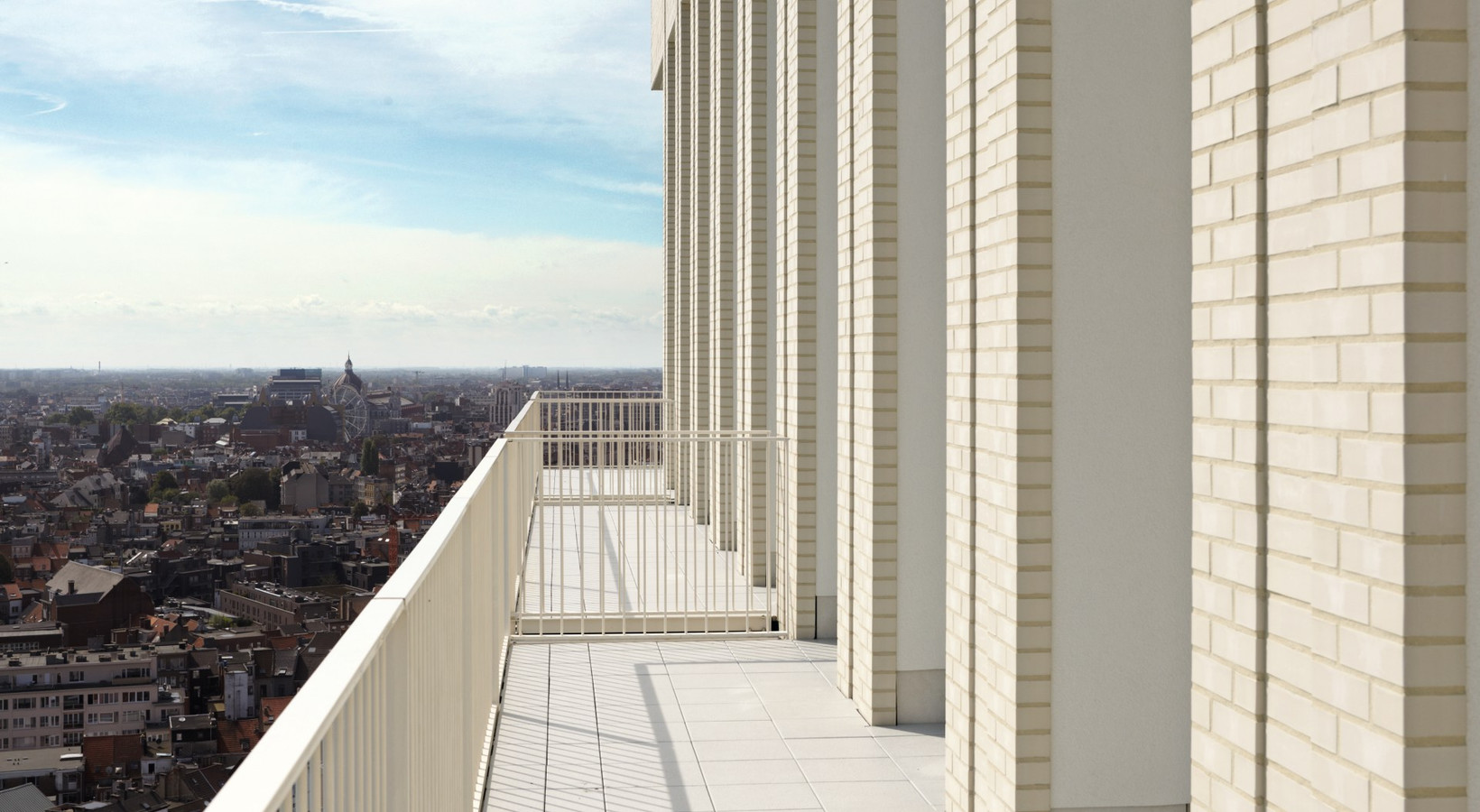
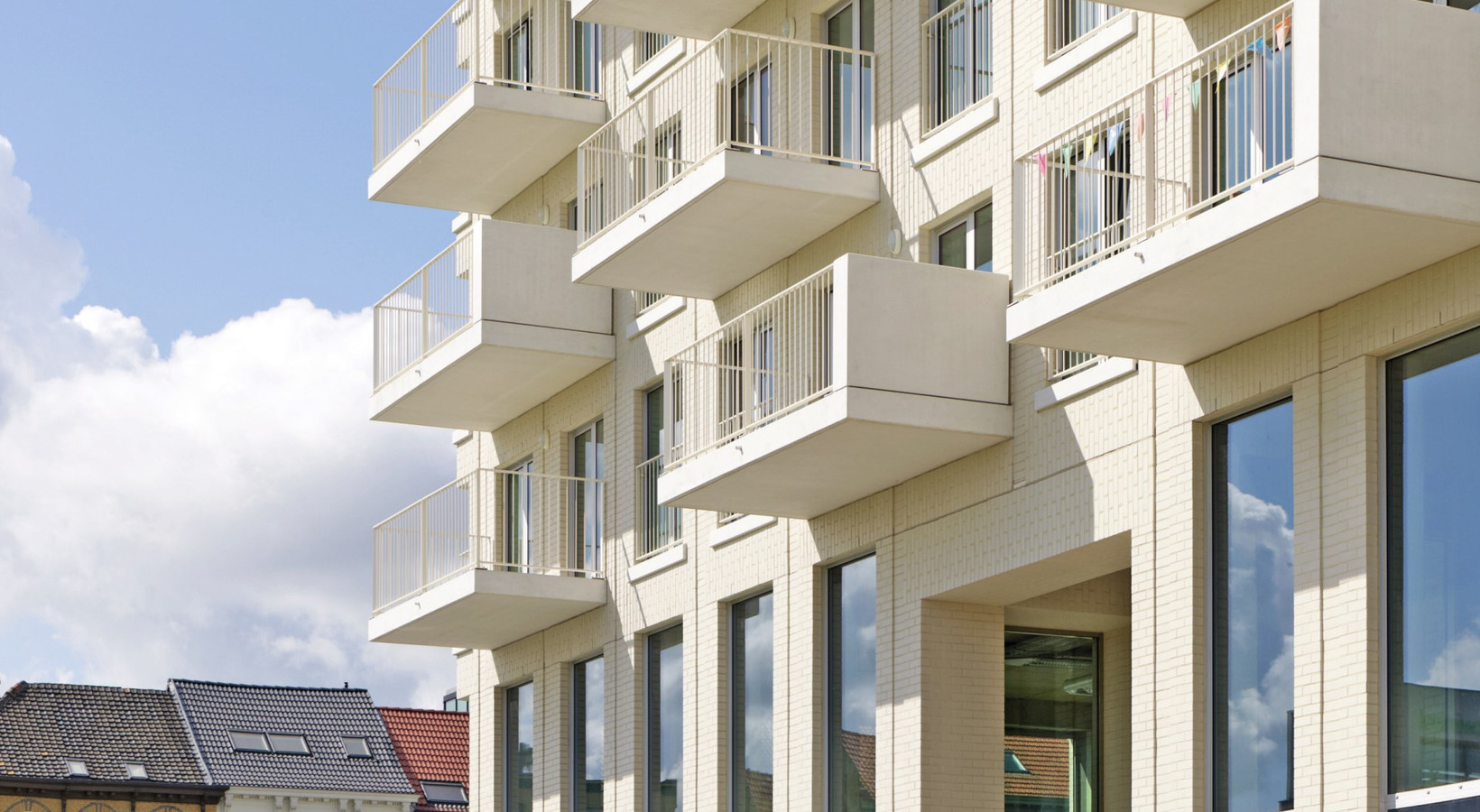
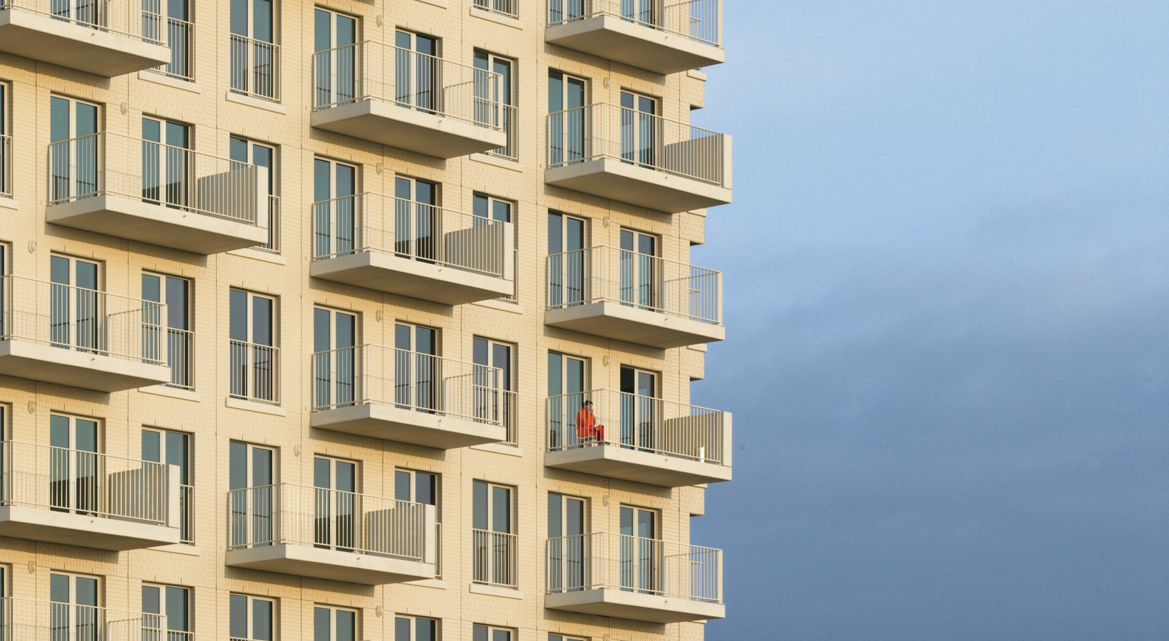
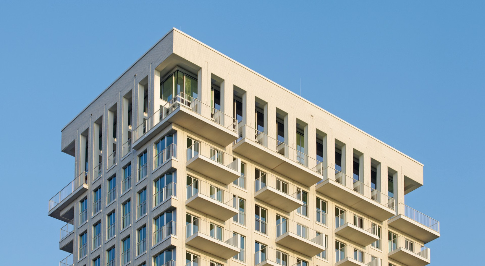
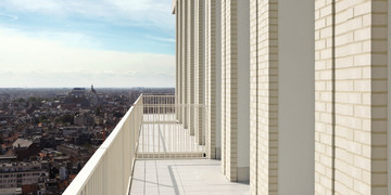
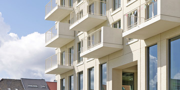
The light tower, seventy meters high, stands out with its luminous, clinker façade and narrow and a storey-high windows. An interesting accent is a two-story mezzanine with retail space and brick arches in the shape of arcades. Interesting solutions can also be found in the space of the two upper storeys with Penthouse apartments. As we approach the building, terraces and loggias protruding east and west are becoming more and more visible, which, due to their irregular location, emphasize the vivid nature of the entire façade. AWG Architecten is one of the most renowned design office in Belgium. Architects have recently managed to change the image of the complex with the same name of Luminous Tower at the area of Philips plant in Eindhoven. Its shiny white façade is one of the most important examples of classical modernism in the Netherlands. “We wanted to achieve exactly the same effect in Antwerp,” say the architects, thus explaining why the new building has the same name.
Precious clinker
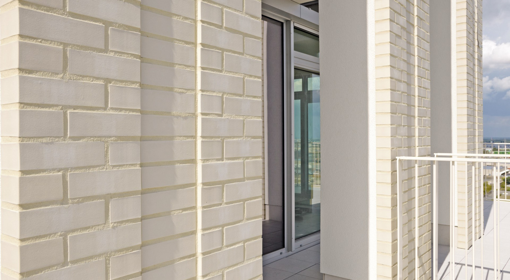
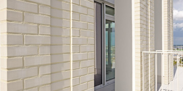
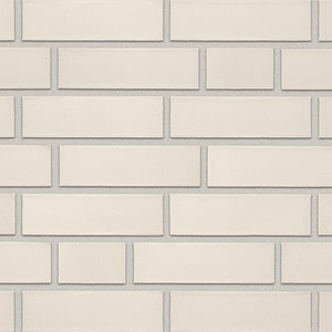
Our guiding principle in the design of the Luminous Tower was to create a universal spatial concept with a flexible horizontal projection, so that the building could be adapted to changing requirements at any time. “The façades effectively hide the functional character of the building interior. Only protruding terraces and loggia reveal that the object is in fact a residential building,” the architects emphasize. The decision to use white clinker ceramics was made during the design process. “In order to design a building characterized by solidity and cohesion and a characteristic uniform building structure, we decided to use the Röben white ceramic clinker for aesthetic, practical and financial reasons,” say the architects. The smooth pearl white clinker brick Oslo in the most common NF format (240x115x71 mm) perfectly suited their concept. The shiny white bricks convinced designers not only with their smooth and uniform face surface, but also with a guarantee of low water absorption – below 2%, as well as their lack of sensitivity to dust and exhaust gases. These unique properties of the material were achieved as a result of burning of clay at very high temperatures – up to sintering, so that the dirt particles cannot penetrate deep into the bricks. Therefore, the proximity of a traffic junction important for the city with a high traffic volume does not pose a threat to the building: the fumes are not able to cause permanent damage to the white brick façade.
Unusual façade
Due to the large surface of windows, brick surfaces do not dominate the structure. Vertical sections were built by means of running bond with bright joints. In the middle, designers decided to place individual bricks slightly protruding and lying one on top of the other. In this way, it was possible to refer to the whole façade, continuing the vertical character of the mezzanine storeys in the shape of arcades. In the horizontal window sills, the clinker was laid in a vertical way to achieve the impression of contrasting façades. “We did not use special prefabricated building elements for this. Window lintels were classically made using steel girders,” the architects explain.
