District Court in Katowice Austere, serious, dignifie
Austere, serious, dignified ... That is what a court of justice should look like. The newly created building of the District Court in Katowice stands out with the genius harmony of the style of the building with its intended use.
The buildings in Katowice, so far associated mainly with chimneys of factories and industrial architecture, change their image more and more every year. The capital of Silesia owes these transformations, among others, to the consistently implemented urban concept and large public investments, such as the building of the District Court that was recently put into use. Both court employees and its visitors enjoy the new headquarters, which is at the same time a unique architectural building. It rarely happens that the appearance of a building so well reflects the nature of the institution located inside.
From the plan to the completion
For many years, the District Court in Katowice was dispersed throughout the city – its branches were located in several different buildings, often in too small rooms. This made the work of the court difficult and burdensome for the applicants. It had long been planned to erect a new, large building. A few years ago, the Ministry of Justice finally decided to implement this important investment in the infrastructure of the justice system in the Silesian Voivodship. The city authorities devoted a huge plot of land for construction between the Francuska Street and the Damrota Street for a symbolic notary fee. The design of the new seat of the District Court was prepared by the Archistudio Studniarek + Pilinkiewicz studio from Katowice, its authors being Tomasz Studniarek and Małgorzata Pilinkiewicz. The construction itself lasted three years and the main contractor was Budimex Dromex. The completed facility, which cost PLN 60 million, was officially presented at the end of September 2009.
Austere façades
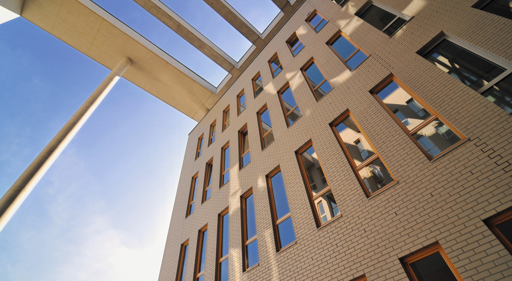
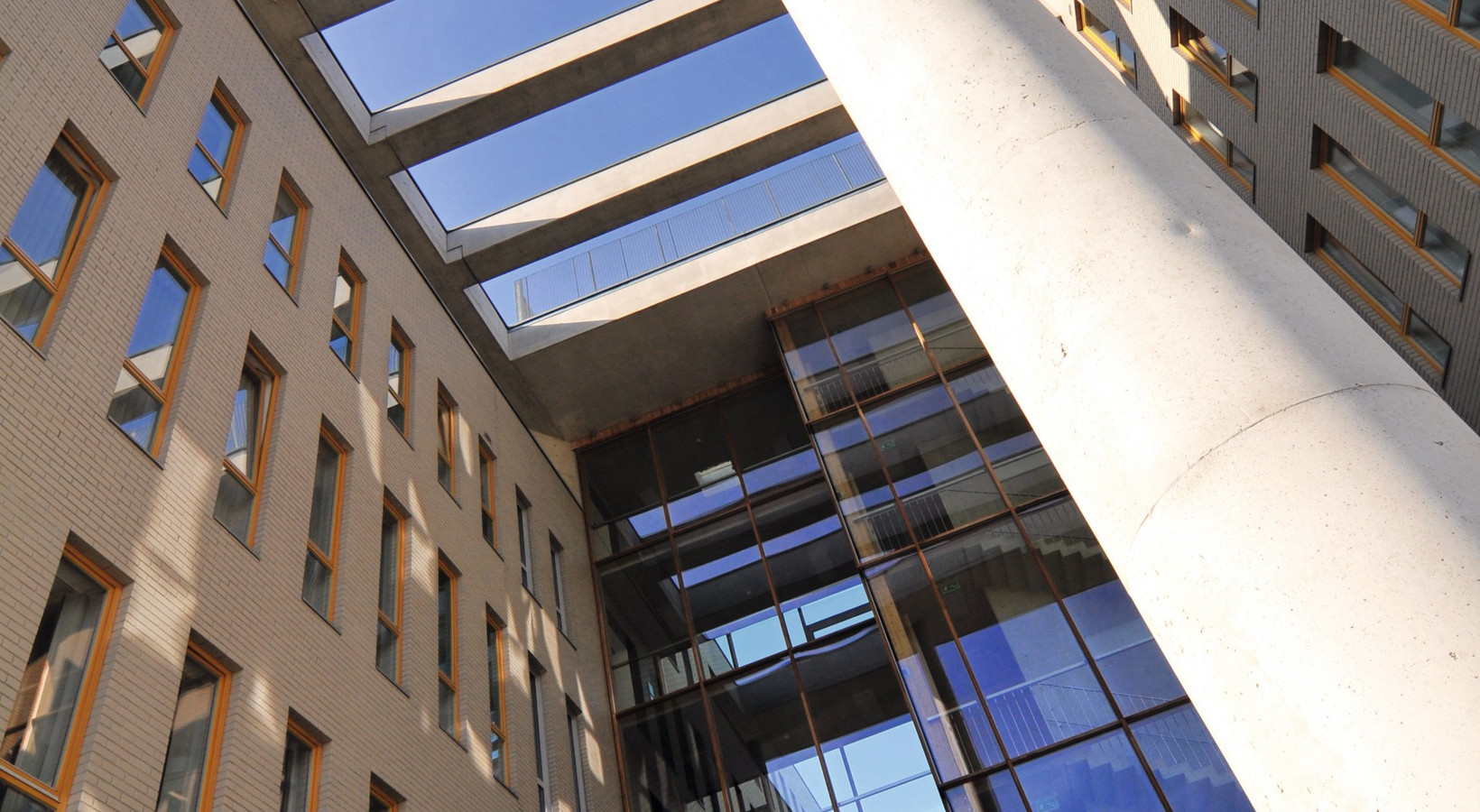
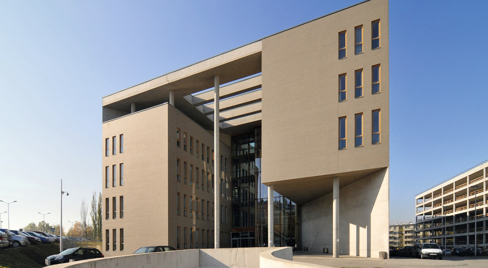
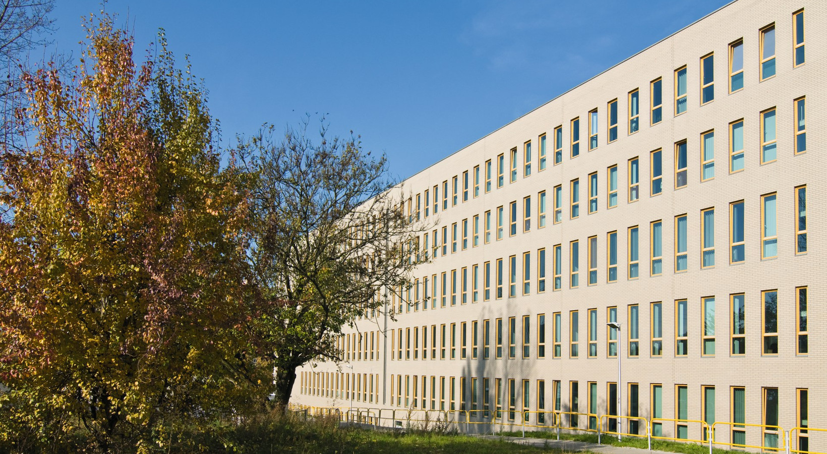
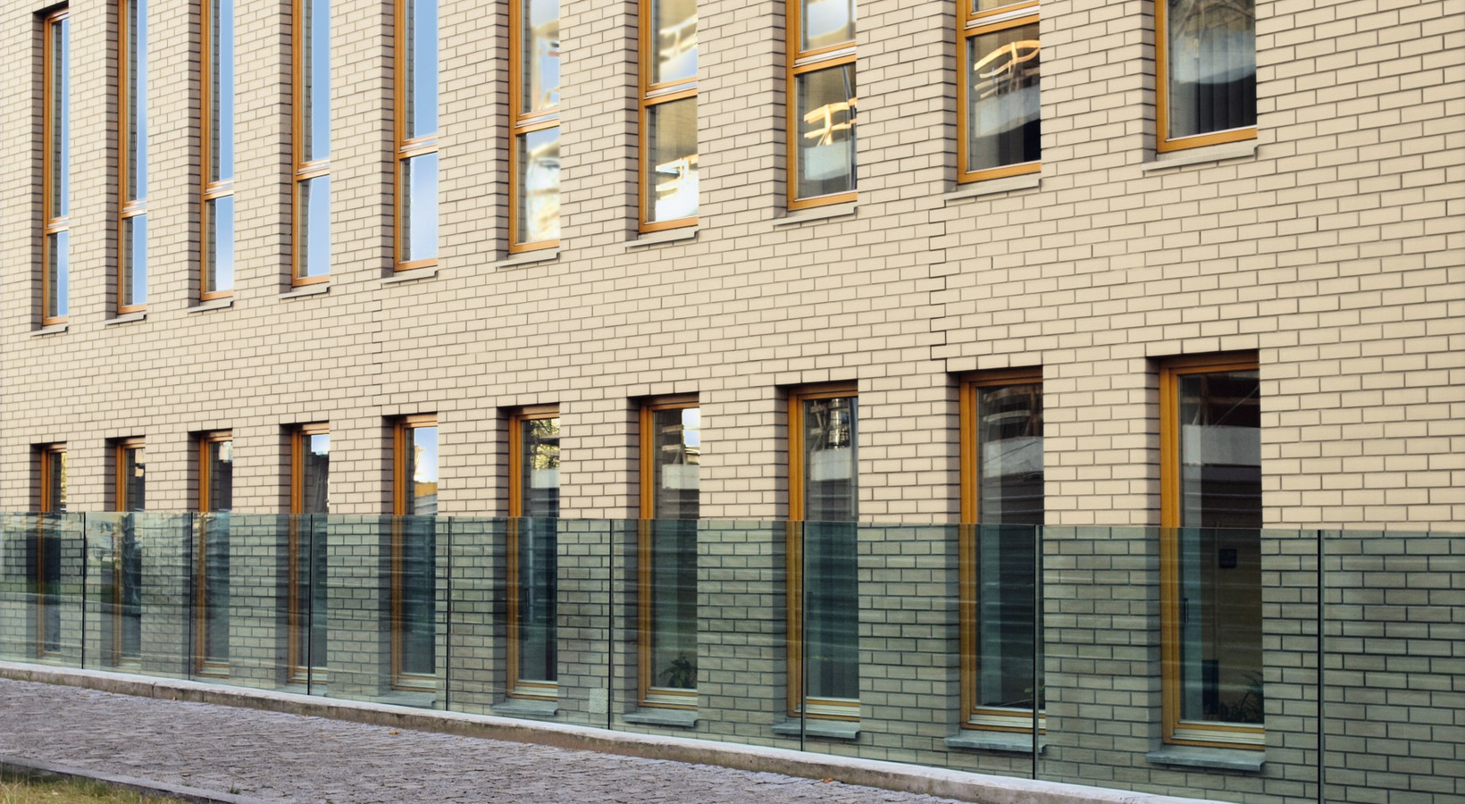
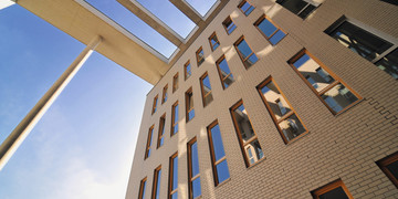
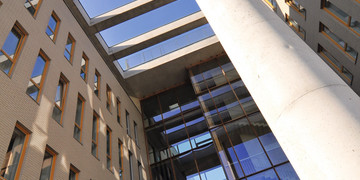
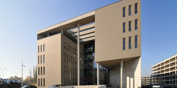
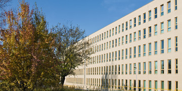
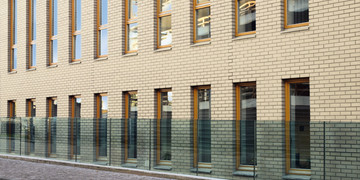
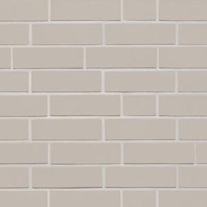
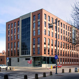
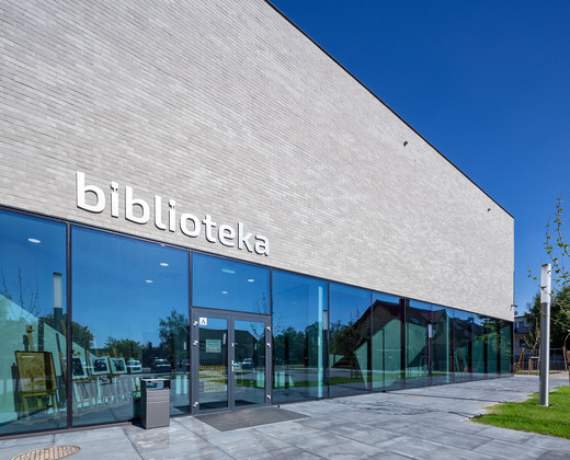
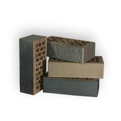
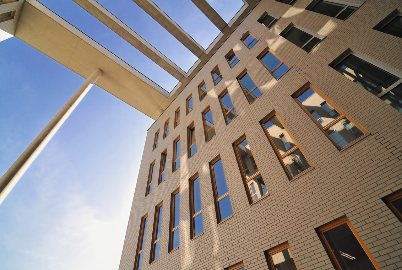
The new edifice of the District Court in Katowice is a monumental structure in the shape of a cuboid. Its façades are smooth and uniform, which gives them austerity. The façade on the long sides of the building does not have any decorations, slants or surface bends – it is made only of gray Röben FARO clinker bricks and regularly placed, longitudinal windows. The gray color and the symmetry and simplicity of the façade make the building look serious and dignified. Equally majestic, though differently shaped, are the shorter sides of the building where the entrances are located. The representative main entrance, intended for applicants, has the shape of a portal and is 25 meters high. The façade made of glass is strongly withdrawn, surrounded by gray architectural concrete planes with concrete columns at the forefront. By association with ancient or renaissance buildings, the columns create a symbolic bridge between the centuries-old history of justice and the contemporary times.
Gigantic size, impressive amount of materials
Not only the shape and color of the façade make new headquarters of the District Court look serious. The huge size of the building plays an important role here as well. This six-storey building is 115 m long and 40 m wide. The court branches occupy over 15.5 thousand m2, the same area as the main hall of the Katowice Spodek. The gigantic size of the object translates into a huge amount of used materials. More than 280,000 basic gray smooth shaded Röben Faro bricks with dimensions of 240x90x71 mm were used to construct the building. In addition, the order included about 8,000 solid bricks, 5,000 perforated NF bricks (both types 240x115x71 mm), as well as over 2,500 perforated bricks ½ NF (240x58x71 mm). However, that is not all. About 7,400 pieces of façade tiles and three types of fittings were needed for the construction of the District Court building in Katowice, the total number was over 90,000. Röben delivered almost four hundred thousand bricks to the construction site! Taking into account that as many as 50 trucks arrived to Katowice from the factory in Środa Śląska, it was a considerable logistic undertaking. A large building requires large-scale activities.
Monumentalism outside, functionality inside
Behind the austere and monumental front façade, there is a spacious, friendly interior, designed to fulfill the function of the seat of the court in the best way. 51 new hearing rooms allow for a much faster work of the court of justice than before. The building has two separate entrances: for the employees (from the Damrota street) and for the customers (from the Francuska street). Also the corridors for the court staff were separated from those used by the petitioners. A large, open lobby that runs through the entire length of the building facilitates the orientation of the visitors who enter the gigantic building for the first time. The solutions applied inside the building are also satisfactory to the judges who descend from their rooms on the top floor directly to the courtrooms by means of separate stairwells. The precision with which all details were planned to ensure the best building functionality is impressive. The aesthetics of the interior also attracts attention. The courtyard has façades similar to those outside the building, also made of gray Röben FARO clinker brick, but the hall does not come into direct contact with the façade. It is limited by glass walls, while the space between them and the façade is filled with plants. The creation of this unique garden and the use of cedar wood in the interior significantly warms the lobby and gives it a friendly character. In this symbolic way it is emphasized that the court, although serious and dignified, works for people and cares about their needs.
